Case study · Engagement design · Gamification · Design system

Giving a financial literacy app a reason to come back to


Vespid’s users liked the short lessons but drifted away once the novelty wore off. We diagnosed the habit loop, rebuilt the design foundation, and redesigned the screens that bring users back each day.

Client
Vespid, financial literacy app (Malaysia)
Role
Product design and creative direction
Timeline
July 2026 to now
Scope
Research, design system, 6 core screens, AI asset generators
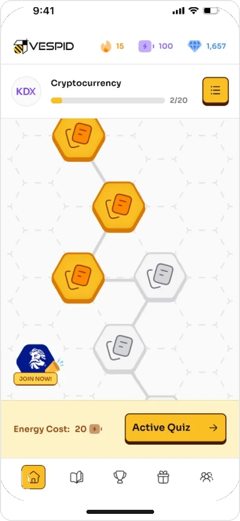
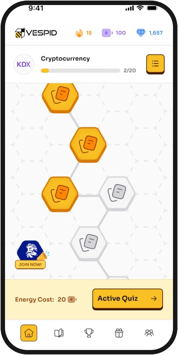
Redesigned Vespid Home screen with the learning path
6 core screens

Vespid design system

Sora · Aa

ButtonPillsLesson cardAccordionNavigationInput field
7-day1KRayaAI badge generator

Context

The product

Vespid teaches personal finance through bite-sized flashcards and quizzes. Users earn Diamonds and redeem them for vouchers. The team wanted learning to feel like a daily habit, not a one-off course.

The problem

No long-term reason to return

Users had no long-term reason to return once the first lessons were done.

It looked like a banking app

The interface looked like a banking app, which worked against the game.

Rewards were out of sight

Streaks, rewards and progress existed, but users rarely saw them at the moments that mattered.

Diagnosis

We started with the loop, not the screens

We mapped Vespid’s core loop and found where it broke. Lessons themselves worked well. The weak points came after a lesson: progress wasn’t visible on Home, the streak didn’t feel worth protecting, and the path to the next lesson wasn’t obvious.

  1. 1Entry

    In Vespid

    Home, Learning Path

    What we found

    Next lesson not obvious

  2. 2Core action

    In Vespid

    Flashcards, Quiz

    What we found

    Strong: users liked the short format

  3. 3Reward

    In Vespid

    Diamonds, Streak

    What we found

    Rewards hidden away from the main flow

  4. 4Return

    In Vespid

    Streak, reminders

    What we found

    Little reason to come back tomorrow

Return feeds back into Entry: the loop only works if all four stages hold.

The work

  • User IV data
  • Market research
  • User persona
  • Journey map
  • Redesign recommendation
  • Gamification
  • Information architecture
  • Typography
Research board with the learning experience and reward findings

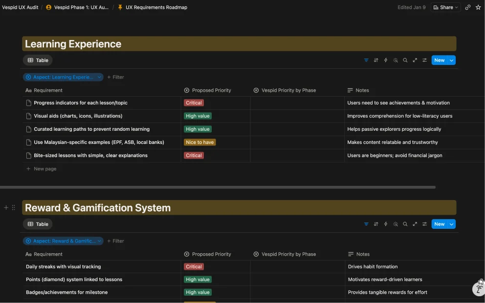
1. Research and journey map

Structured user interviews and a new journey map, from lesson to Diamonds to voucher. We found the gap between the game Vespid wanted to be and how it felt to use, and kept what users already loved: the short, bite-sized lessons.

☺Title text⌄
⌂▢⎔◌⚇
PasswordEnter your password
+ Button +
Kamal ›🔥 6◇ 1,450

2. A new design foundation

A design system with a more energetic palette that still feels trustworthy for money: new typography, colour and a full component library (buttons, cards, progress, sliders, navigation and inputs), so every new screen starts from the same parts.

Home
CampaignJoin campaign
LeaderboardShare
ProfileSettings
RewardsBrowseMy reward
LessonFlashcardQuiz

3. Redesigning the core screens

Over seven weeks, we redesigned six screens with a team check-in after each one:

  • Home: today’s lesson and progress come first
  • Learning Path: a clear view of what’s next, with a path-building animation
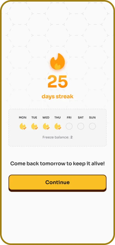
  • Streak: a default and a freeze state, so one missed day doesn’t undo weeks of effort
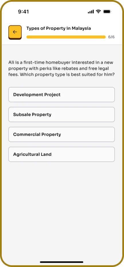
  • Lesson: flashcard and quiz states in one consistent flow
  • Active Quiz: a timed challenge mode with an energy system
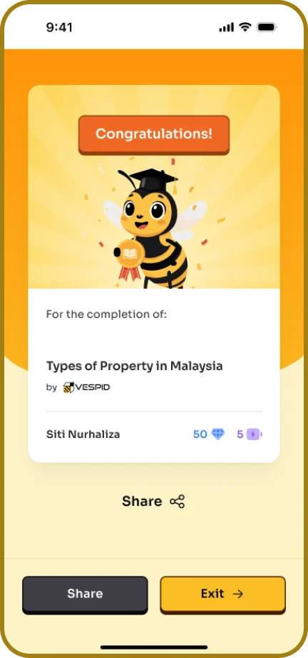
  • Journey flows: completing a lesson and an Active Quiz from start to finish
Milestone badge Deepavali campaign badge 100-day streak badge
Kawan character Wei JieKawan character AinaKawan character PriyaKawan character Ryan

4. AI generators for badges and characters

To let the team make new rewards without a designer on every request, we turned the visual rules into two Claude skills. They generate on-brand badges (milestone, streak and campaign) and poses for the Kawan character cast, ready to export. Both are built to be white-label, so a partner can swap in their own colours and logo.

The redesign

Home
Complete LessonFlashcardChapter Quiz
Take Active QuizAnswer quiz
Earn Reward

Sora font

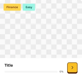
  • Course/Lesson Card›
  • Accordion›
  • Button›
  • Checkbox›
  • Input field›
  • Navigation›
  • Pills›

Design decisions explained

A colour system built for energy, not just trust

Financial apps default to blues and greens to signal trust and stability. We kept that credibility but layered in a more vibrant accent palette, closer to what users expect from a game than a bank statement.

A component library, not just screens

Rather than redesigning screens one at a time, we built a full system (buttons, cards, navigation, inputs), so Vespid’s team can design and ship new features consistently without rebuilding the visual language each time.

Reward visibility throughout the journey

We redesigned how Diamonds and progress show up across the experience, not just on one rewards screen, so users see what they’re working toward at every step, not only at the end.

In their words

“Sweevo showed us where our learning loop was breaking before he touched a single screen. Now our team has a design system we actually use, and we can make new badges and characters ourselves.”

Edrea Lee, CEO / Founder, Vespid

What this shows

The same method, on your app. Vespid’s work followed the steps of a Sweevo engagement: diagnose the loop, fix the screens behind the biggest findings, then build the system so the team can keep shipping.